Grading America on Nonvisual Design: Three Everyday Venues, One Blind Reviewer, Zero Excuses

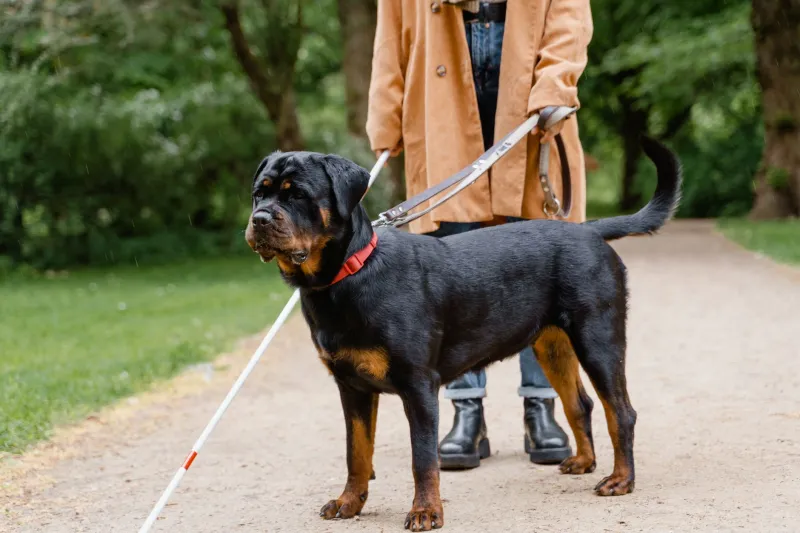
Let's be honest: most "accessibility reviews" are written by people who have never needed one. So we flipped the script. We sent our own reviewer — blind since her twenties, armed with a white cane, a screen reader, and a stopwatch — to three of the most American venues imaginable: a sold-out NFL game, a big-city art museum, and a suburban mega-grocery store.
The goal wasn't to catch anyone doing it wrong. It was to figure out what "doing it right" actually looks like, because the difference is usually not money. It's intent.
Kickoff: The Stadium Mostly Gets It Right
Walking into the stadium was, honestly, the smoothest part of the whole day. Ticketing staff had been trained — you could tell because nobody grabbed her arm or steered her like luggage. An escort walked slightly ahead, called out turns, and got her to a seat with a companion spot that wasn't shoved behind a pole.
The audio description of the game? Available through an app, but you had to know it existed. Nobody at guest services mentioned it. That's a recurring theme in this whole experiment: great features hiding in silence.
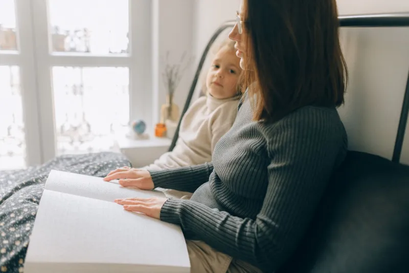
Concessions were the weak spot. Braille menus existed at one stand out of about thirty. Ordering by app worked fine until the pickup shelf — a free-for-all of unlabeled bags. Score: a solid B, docked for treating accessibility like a back-of-house secret.
The Museum: Beautiful Art, Quiet Barriers
Here's the thing about museums — they've had decades to figure this out, and some have. This one offered tactile reproductions of three major works, audio guides with rich verbal descriptions, and docents who didn't flinch when asked to describe a painting out loud. One guard even volunteered to walk her through a sculpture's shape with his hands open, palms up, asking permission first. That's training. That's culture.
But the building itself fought back. Rotating exhibits had no tactile maps. Wayfinding was purely visual — pretty fonts, zero contrast for low-vision visitors. And the gift shop? A maze of glass cases and zero verbal inventory.
A museum can describe every brushstroke and still forget to tell you where the bathroom is. Grade: B-plus for heart, C-minus for the parts that cost nothing to fix.
The Grocery Store: Where ADA Boxes Go to Be Checked
The grocery run was the most revealing — and the most frustrating. Legally, this store was a fortress of compliance. Ramp? Check. Accessible parking? Check. Wide aisles? Check.
Practically? Good luck.
No store map in an accessible format. Shelf labels in standard print only. The screen reader on the store's app listed products as "Item 40928" more often than any human should tolerate. When she asked an employee where the soup was, the answer was "aisle seven" — which tells you nothing if you can't read the aisle signs.
What saved the experience were people. A teenager in a stockroom vest walked her aisle by aisle for twenty minutes without being asked twice. That's not accessibility. That's one kind stranger papering over a system that wasn't built with her in mind.
The Pattern Worth Noticing
Across all three visits, the same truth kept surfacing: the best nonvisual design wasn't expensive. It was verbal. Trained staff who describe instead of point. Consistent layouts. Signs that say what they mean out loud. Apps that label things like a human would.
The failures weren't budget failures. They were imagination failures — the assumption that access means a ramp and a certificate on the wall.
If a stadium can get most of the way there, so can a grocery store. And if your business is waiting for a lawsuit to care, know this: blind customers remember who designed the door for them, and we tell everybody.